Command Alkon Website
Their goal for the website rework was to create a more user-friendly, accessible, and visually aligned platform that reflected their updated tech-focused brand identity. I collaborated closely with marketing, leadership, and developers to deliver a modernized website that met their objectives.
-
Align the website with Command Alkon's visual identity
-
Update the navigation for better user flow
-
Create a site that is easy to update as the company grows
-
Work with the Dev team to implement
Homepage:
User Flow
Challenge
The previous homepage lacked any paths towards product pages and relied heavily on the menu nav to get users to product pages. Space was wasted on unneeded callouts and the company's own information instead of easy links to items users actually need.
Solution
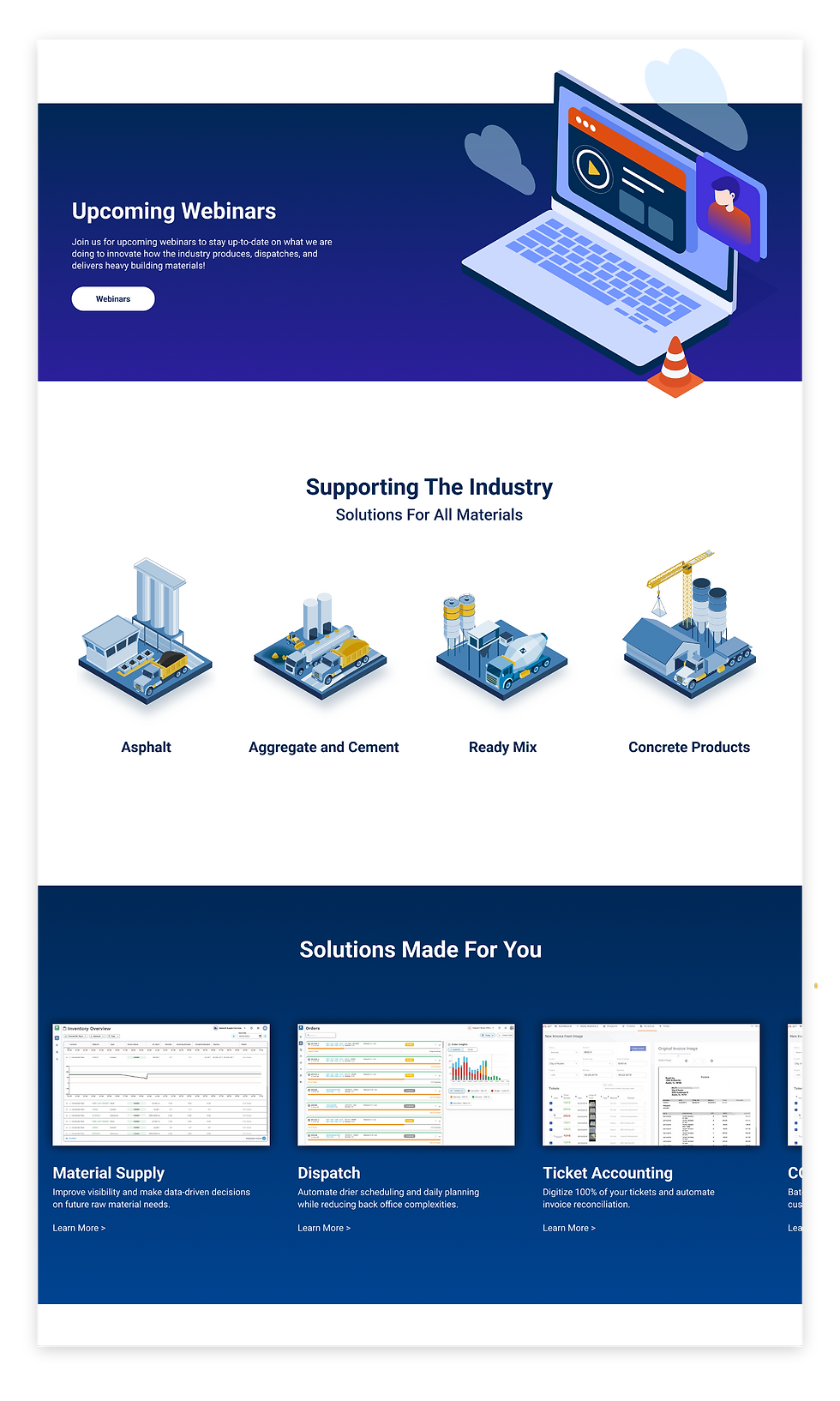
I introduced bold imagery, concise messaging, and interactive elements to make the homepage more engaging. Calls-to-action were strategically placed to drive deeper engagement, while the layout was optimized to immediately showcase the company's products

To immediately engage visitors, I redesigned the hero section of our website into a smaller ribbon which allowed the first content section to be visible on page load, reducing scroll friction and leading them to our main product offering quickly.
I incorporated a clean layout that balances branding, key information, visuals and clear CTA to help users dive deeper, quicker.
The top 30% of our homepage is the most viewed, so immediately communicating our value here is best.
Navigation: Streamlining
User Flow
Challenge
The existing navigation system created friction for users, with poorly grouped products and services that made it difficult to find relevant information. Understanding the diverse needs of Command Alkon’s audience required rethinking how to organize and present their offerings.
Solution
Through research and collaboration with stakeholders, I designed a custom navigation structure tailored to the site that group products intuitively, added easy discovery of products across audiences.
To improve user engagement after scrolling down I integrate CTAs to Command Alkon's key marketing targets, such as webinar sign-ups. This addition provided direct access to lead focused content.
I implemented the ecosystem graphics in a section below, adding a visual engaging navigation element that is still obvious to less tech focused users, like Command's audience.
Further down the page, I introduced a dedicated section for key solutions that Marketing and Sales are prioritizing. It is further down the page since sata analysis showed that only about 10% of users scrolled beyond and most of our customers do not know our products by name.,


The Main Nav
The main product navigation took the most time to figure out and get leadership agreement on. Because Command has so many different products across many different channels of the industry it's hard to group them without alienating one or more other groups. The previous nav repeated products if they were used in different industries, assuming users would know where to look.
My solution
I created a menu that showed all the products by name at once. This required a custom coded menu on the Wordpress site but was well worth the effort since it allowed users to find the product they needed in one click without assumptions on our part.
More of My Stuff
Process
Research
I collaborated with the marketing team to understand their audience's needs and expectations, identifying key areas for improvement in user experience and visual design.
Design
I crafted a series of modern, visually cohesive page layouts. These designs emphasized clean navigation, dynamic visuals, and improved accessibility.
Implementation
Working alongside the dev team and leadership, I ensured the seamless transition of designs into a functional WordPress site while maintaining the brand's vision.


